
Readable Typography
Typography should facilitate reading and avoid confusion, especially in contexts where information must be quickly and clearly understood. Designing simple letters, with good spacing and adequate size, ensures that they are accessible to a diverse audience.
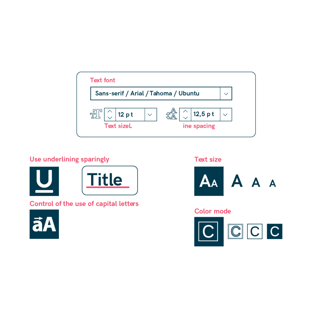
- Use clear fonts like Arial, Tahoma, or Ubuntu, and stick to sans-serif styles, avoiding decorative or complex letters. Use medium-weight fonts (round or semi-bold) for short texts and avoid overly decorated fonts. Consider adapted fonts like Parisine, Frutiger, or Roodggek for better legibility.
- Avoid italics, as they make text harder to read.
- Opt for large letters, especially for people with low vision, and refrain from using ALL CAPS to ensure better readability.
- Use underlining sparingly, only for important highlights, and avoid using color in text to prevent distractions.
- Limit special characters, as they can confuse readers, and choose simple and clear lettering, such as round or semi-bold fonts, with adequate spacing.
- Consider the optical size of the font, ensuring proportions between letters like «x,» «j,» «l,» and «t» are balanced.
Sources
- https://biblioteca.fundaciononce.es/publicaciones/colecciones-propias/coleccion-accesibilidad/accesibilidad-universal-y-diseno-para
- https://www.punt6.org/es/books/espacios-para-la-vida-cotidiana/
- https://www.une.org/encuentra-tu-norma/busca-tu-norma/norma?c=N0043689
- https://observatoriodelaaccesibilidad.es/wp-content/uploads/2022/05/Guia-de-Accesibilidad-Cognitiva-en-Centros-de-educacion-infantil-y-primaria.pdf