
Easy-to-Read Text Format
Typography should facilitate reading and avoid confusion, especially in contexts where information needs to be quickly and clearly understood. Designing simple letters with good spacing and adequate size ensures accessibility for a diverse audience. Clear, concise text is essential for readability, so break up long sentences into shorter, more digestible lines and use natural breaks to guide the reader. Ensure the background doesn’t interfere with the text and use simple formatting, like bullet lists and left-aligned text, to keep things organized. Avoid distractions like footnotes to maintain focus and clarity.
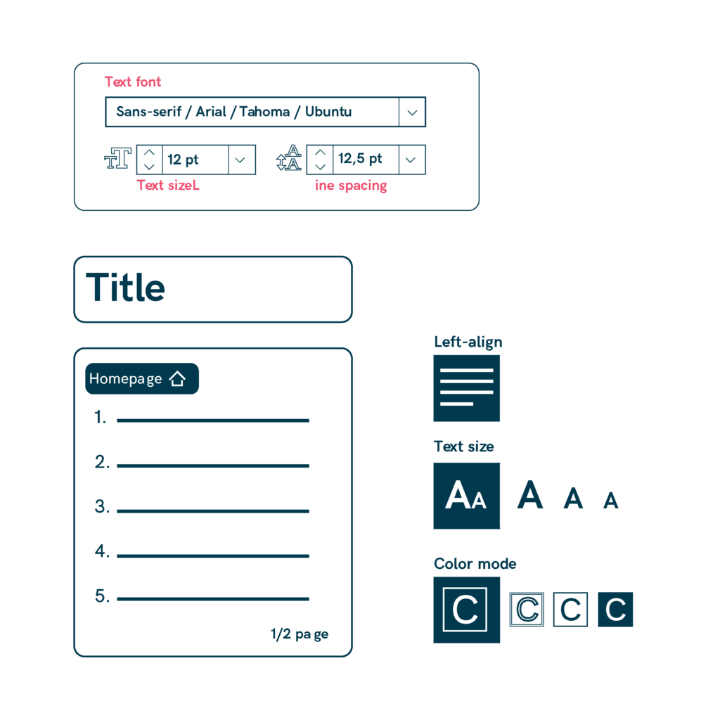
- Use simple, clear fonts: Choose easy-to-read fonts like Arial, Tahoma, or Ubuntu, and avoid decorative or complex styles.
- Use medium-weight fonts and ensure adequate spacing for better readability, especially for those with low vision.
- Keep text short and concise by breaking sentences into one line and using natural breaks.
- Ensure titles are easy to understand and organize information with bullet points for better structure.
- Left-align text for optimal readability and avoid using columns, which can make reading harder.
- Make sure the background doesn’t distract from the text, and ensure sufficient contrast for readability.
- Refrain from using footnotes, excessive italics, color in text, or special characters that may confuse the reader.
- Include page numbers and allow easy access to the homepage with clear, simple navigation.
- Opt for present-tense verbs to create dynamic, engaging content.
- Use digits for numbers, avoid percentages and Roman numerals, and opt for full dates to maintain clarity.
- Learn more here
Sources
- https://commission.europa.eu/resources-partners/europa-web-guide/design-content-and-development/accessibility_en
- https://www.w3.org/TR/2008/REC-WCAG20-20081211/
- https://spet.indimoproject.eu/recommendations/
- https://www.audioeye.com/accessible-web-design/download-pdf/
- https://www.codigotecnico.org/pdf/Documentos/SUA/DccSUA.pdf